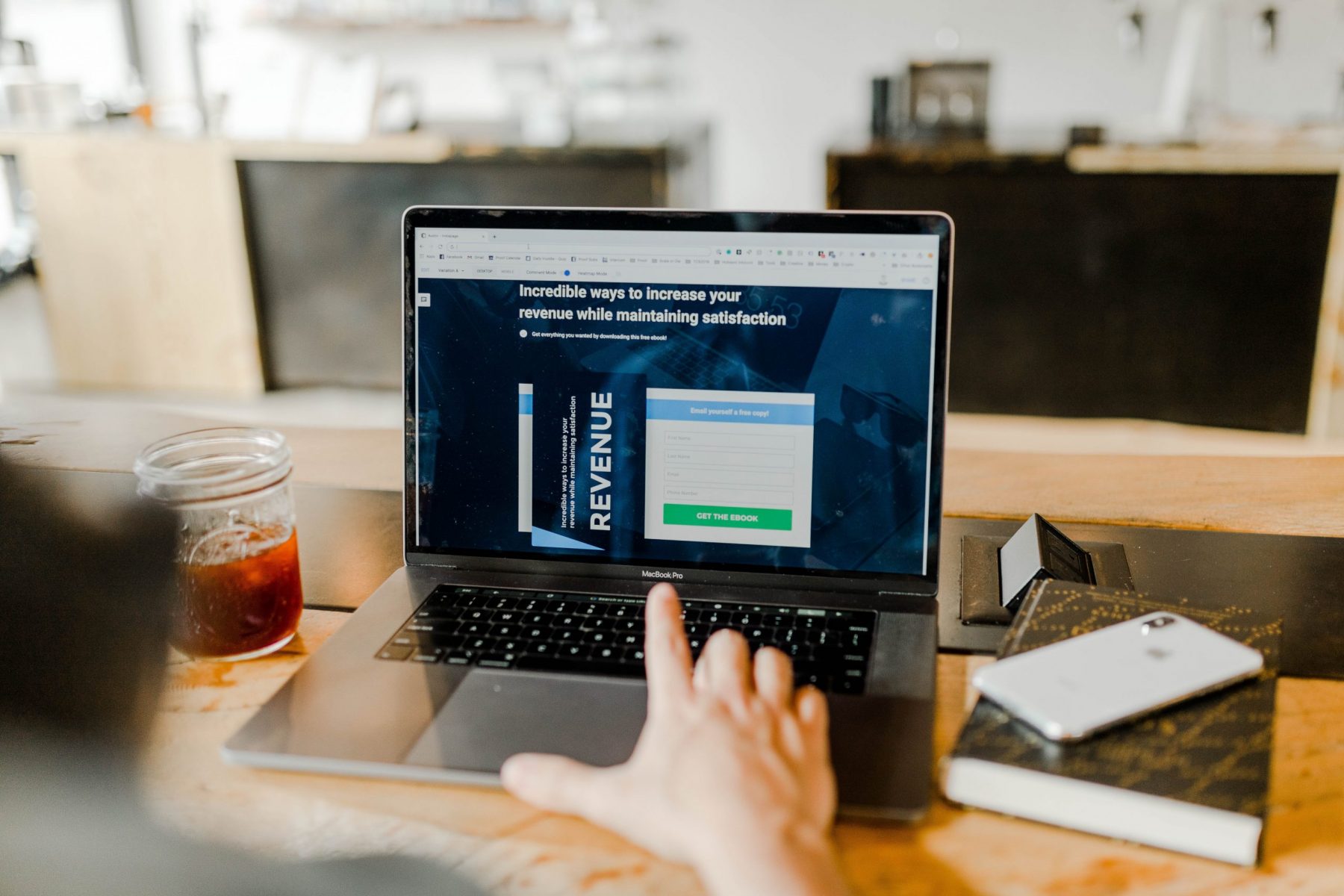
So you’re looking to make a landing page for your product, one that attracts and converts visitors. Making an effective landing page is actually harder than you think! There’s so many decisions that need to be made, and some of these questions you don’t even think about.
From deciding where to place your images to deciding on what colour your Call-to-Action button should be, there is a lot that goes into creating a great landing page.
Luckily, we can look at some great product landing pages currently out there on the Internet and see what they’ve done for their page to look so good!
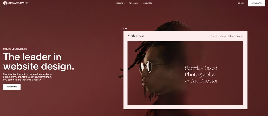
Source: Squarespace
A quick peruse of these standout webpages and you’ll see that there are 3 key web design elements that are in each of them:
- Great UX
- Great above-the-fold design
- Great scannability
In this article, we take a look at each of these elements, learn why they’re important and how you can implement them in your landing pages.
Why your product landing page needs to be great
Landing pages are a gateway to more. More what? More sales, more sign-ups, more customer interactions. When visitors land on your product pages, there is an opportunity for you to take them where you want, whether that be a product checkout or a sign-up page.
However, landing pages that are simply ‘good’ or ‘acceptable’ doesn’t cut it anymore. This is because customer’s attention spans are shorter than ever. Nowadays, the average customer attention span is a whopping 8 seconds!
In other words, when a visitor arrives on your landing page, you have about 8 seconds to convince them to stay longer and take an action you want (such as signing up or making a purchase). Anything else and they may end up bouncing instead!
So let’s go ahead and turn a ‘good’ landing page into a ‘great’ one by learning these 3 key web design elements!
3 web design of great product landing pages
Great above-the-fold design
First impressions are everything, especially when it comes to landing pages. Like we mentioned before, you only have a handful of seconds to keep visitors engaged. It’s why strong above-the-fold design is imperative.
Above-the-fold refers to everything you see on your screen. The ‘fold’ refers to the bottom of your screen.
It’s a term that has been around for ages, dating back to when newspapers were popular. Newspapers were usually folded in half when put on display in shops or stalls, only showing the top half of the front page.
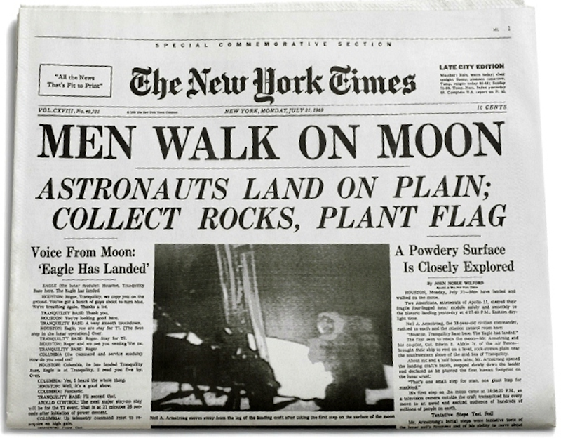
The origins of above-the-fold design. Source: New York Times
Pedestrians would pass by if the top half of a paper wasn’t interesting enough to make them stop and buy one. In the very same way, visitors will leave your landing page if the above-the-fold design isn’t captivating.
The most effective way of creating a good above-the-fold design is by incorporating 3 different yet important elements:
- Headline
- CTA button
- Image/Video
The combination of these three things provides both the information and visual content needed to encourage visitors to stick around.
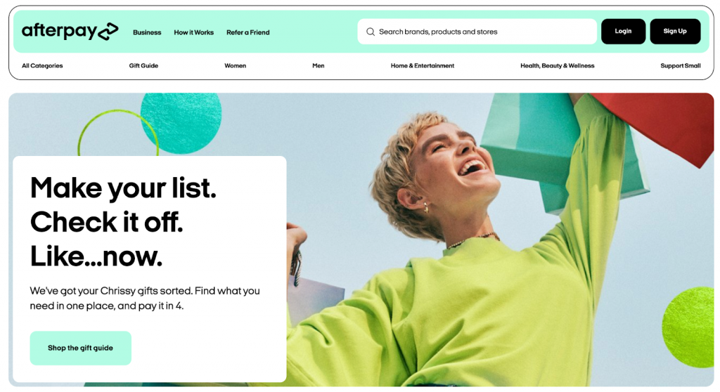
Source: Afterpay
A strong headline will clearly communicate what your product or service is all about. A persuasive CTA directs visitors and encourages them to take actions you want. Finally, an interesting and relevant image or video will captivate visitors while helping them visualise what you are offering.
When all 3 parts are done well, they create a great product landing page, one that has the power to convince visitors to stay, subscribe or make a purchase!
Great UX
User experience (UX) is undoubtedly one of the most important aspects of web design, whether it be for a landing page or a home page. If you need a refresher, UX is how users interact with your website (or landing page).
Great UX is invaluable. It makes it easy for users to find what they’re looking for. It removes obstacles, prevents distractions and increases landing page conversions.
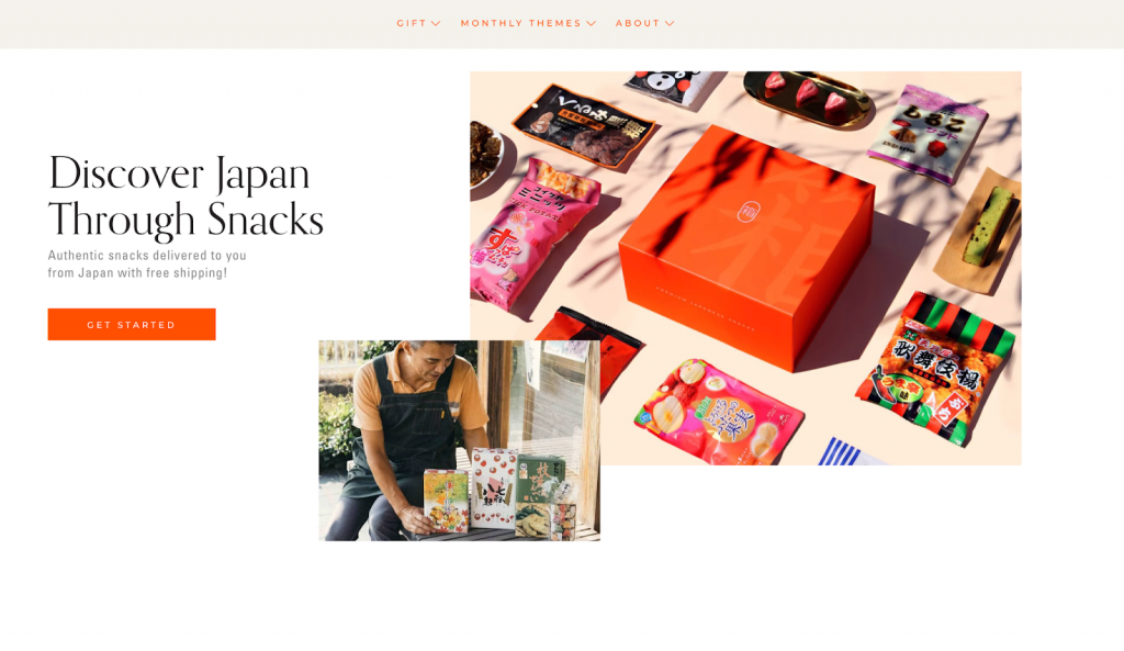
Source: Bokksu
Optimising UX for a landing page will help visitors make decisions; decisions that lead to increased subscriptions or sales.
Here are just a few examples of how you can create a great product landing page by optimising the page’s UX.
- Appropriate use of white space: helps declutter your landing page, making it easier to read and understand what it is you’re selling.
- Eye-catching CTAs: helps guide and persuade visitors to click to where you want them to go, including checkout pages.
- Strong flow of information: use H1s and H2s to break up information, making your page easier to read and navigate.
- Mobile friendliness: over 50% of people will visit your page via their phones; your page needs to look good and work well on mobile devices.
- Easy to read text: Text that is too small makes it difficult to read. Text that is poorly written will also make your visitors confused.
- External links open new tabs: don’t give visitors avenues to leave your page; ensure all links open new tabs instead of redirecting on the current one.
Great scannability
Life moves fast, web page visitors move even faster. Great product landing pages will be easily readable and have high scannability. What does this mean?
High scannability refers to how easily and quickly visitors can explore your page and comprehend what your landing page is trying to communicate.
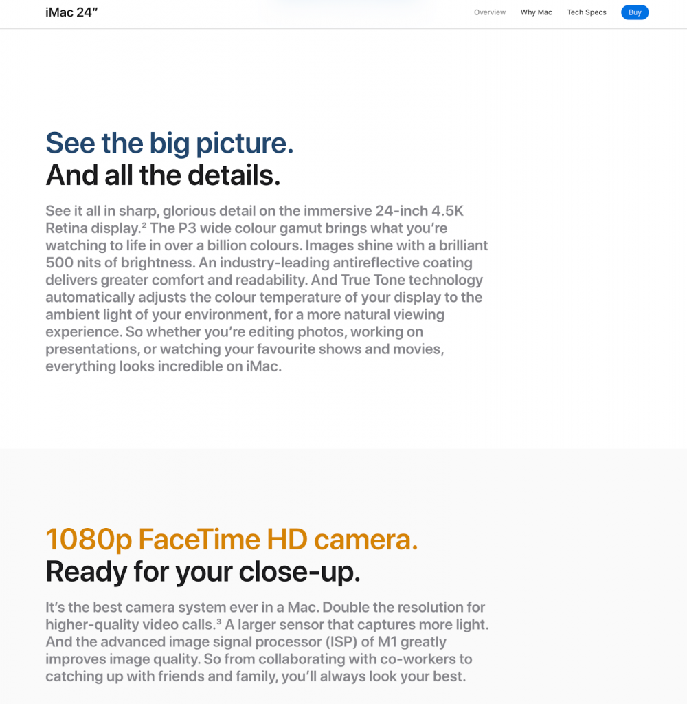
Source: Apple
People usually don’t have time to read every word on your page. We’re not just making this up either! Studies have shown that visitors tend to skim pages and look for information they care about.
This is even more important for landing pages. Landing page visitors are usually first timers, unfamiliar with your brand or what your product is. This means they’ll typically scan your page and decide within seconds whether your offering solves their problem.
Here are some tips to improve the scannability of your landing page.
- Use subheadings: subheadings break up blocks of texts, making it easier to read and helping readers get to the parts they want to read.
- Employ the inverted pyramid: this means that you put the most important information at the top of the page.
- Use bullet points: these help break up large sections of information and make it easy to understand multiple important points.
- Use a clear, readable font: keep illegible fonts such as Jokerman or Bleeding Cowboy far away from your landing page!
- One idea per paragraph: try not to ramble. Keeping paragraphs concise and direct greatly improves readability.
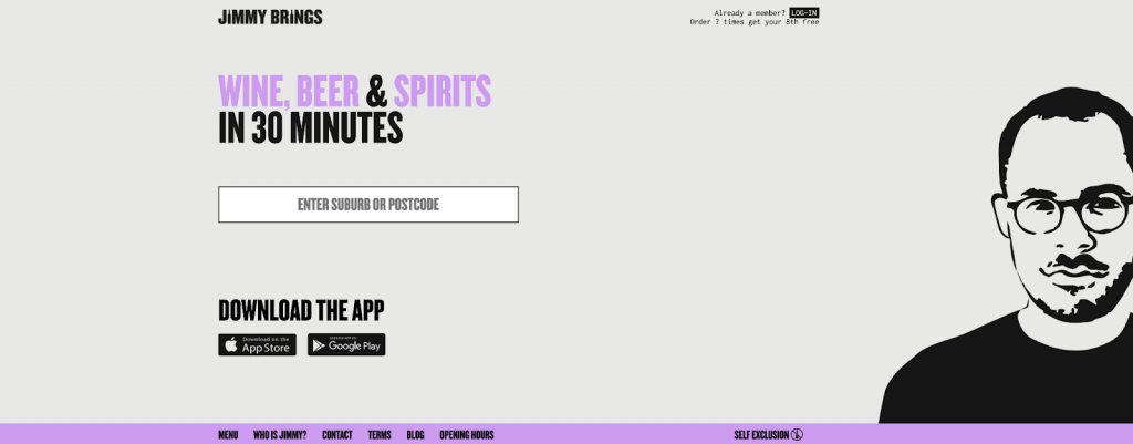
Source: Jimmy Brings
Creating an effective landing page is as simple as 1, 2, 3
By incorporating these 3 key elements into your landing page, you will greatly improve its performance, attracting new customers and making more conversions!
Want more tips on how to create great product landing pages? Or maybe you’re looking for some real life examples? Check out the ZipZipe blog for everything you need – and more!