
If you’re ready to make changes to your website, you’ve probably come across the term “above the fold” already. This term has been around since the advent of the Internet, but it’s becoming less and less relevant today.
Should you opt to have your website designed with above the fold practises in mind? Read on to learn whether above the fold web design can still benefit your website traffic and user experience!
What is Above the Fold?

The term “above the fold” comes from the print world. Newspapers were folded after they were printed, and only the top half of the paper was visible to people once they were placed in newsstands.
The industry soon found that this first half of newspaper was valuable real estate – they began publishing their most attention-grabbing headlines on that portion. The web design industry caught on to this strategy.
Everything that a viewer can first see on a web page before they have to scroll down is considered above the fold. With this in mind, this is where most web designers place important pieces of information, such as the website’s purpose and a clear call to action.
Although above the fold design still applies, it’s becoming less relevant as user habits change.
Eye Tracking
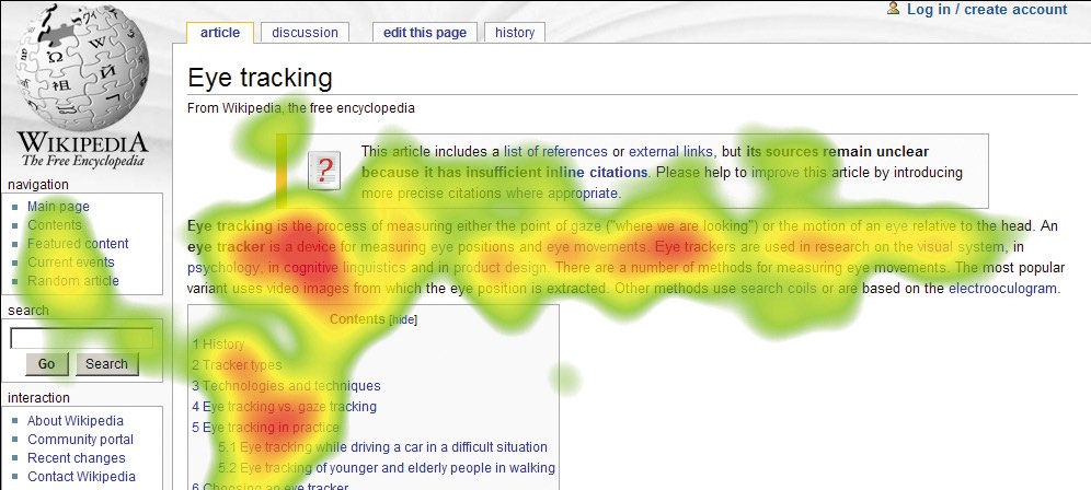
One reason we know that above the fold design is still relevant today is due to Jakob Nielsen’s eye-tracking research. Although the initial research was conducted in 2006, Nielsen has found that eye-tracking patterns are still the same today, even with smaller devices and responsive design.
One of the most prevalent eye-tracking shapes is the F-pattern. People read in a horizontal movement across the upper part of the content area. Then they move down and repeat the movement. Lastly, they scan the content’s left side with a vertical movement, creating the rough shape of the letter “F”.
This is a pattern that web designers want to avoid because it means users are skipping important content on the right side of a page.
The antidote to the F-Pattern
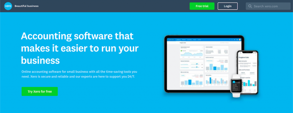
Image source: Xero
One of the main antidotes to combatting people’s common F-tracking pattern is to include the most important concepts above the fold in the first two paragraphs. Without this content, viewers will return to their natural habitat of scanning the page in the F-pattern.
You’ll find that many websites still design with the intent of keeping important elements above the fold. There will typically be:
- A bold headline
- A smaller description
- A call to action
- Photos or graphics that support the text
Users today are far more used to scrolling down pages, but their attention span hasn’t changed. Having clear, captivating above the fold design incentivizes users to continue scrolling down.
They tend to have minimal designs and use bold text and header sizes to indicate different levels of importance.
Above the Fold Less Relevant
Although above the fold design practises still help draw users to the rest of the content, things are being altered. Instead of focusing on above the fold, designers are opting for placing important content near the top of the web page.
Then, they indicate that there is more content for the user to see by providing visual cues to scroll. Here are a few more reasons why above the fold design is becoming less relevant.
Changes to Screen Size
Above the fold applies less today because there are simply too many different screen sizes to account for. There’s no way to predict what will be above the fold for one user versus another.
Changing Purchasing Behaviour
People are becoming more used to researching and discovering information through the Internet on their own. When they want to make a purchase, their first thought isn’t to connect with a customer support representative.
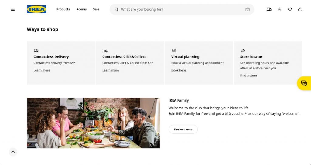
Image source: IKEA
Instead, viewers usually view the first lines of content and then scroll downward to find out more. Simply put, users actually expect to scroll and view content that would be considered “below the fold.”
Overcrowding
If you design your website believing above the fold design is still fully relevant, you’ll run into the issue of crowding too much content in one space. This is understandable because of a belief that viewers won’t be willing to scroll downward, but we know now that scrolling has become second nature for most viewers.
Overcrowding the top part of your web page will actually turn off viewers and lead to higher bounce rates.
Call to Action Myth
There’s still a myth that calls to action need to be above the fold, and if they’re not they become irrelevant. Instead, what people are finding today is that calls to action need to be placed in logical places on a web page where people will feel confident in taking action.
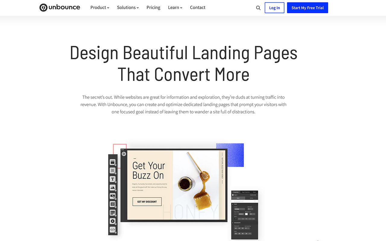
Image source: unbounce
If the majority of your website viewers are uncertain of your products or services, having a call to action immediately above the fold won’t draw them in. In worst cases, it can actually turn off potential customers because it seems too pushy.
The Age-Old Web Design Debate
There are many differing opinions on above the fold design, though many designers seem to agree that it’s becoming less and less relevant. The most obvious reason is that it’s simply impossible to judge what’s considered above the fold now.
What is important to keep in mind is less on what content is above the fold and more on how to entice customers to continue scrolling downward. This is done through old design practises that are definitely still relevant today, such as the use of white space, headers, colours, and visual cues.
Are you ready to improve your website design in order to draw in more traffic? Contact us today to schedule a consultation that includes a custom marketing blueprint and competitive analysis!