Did you know? It takes about 50 milliseconds (that’s 0.05 seconds) for a user to decide if they’ll stay or leave your website. This decision is often made on the website’s homepage. To put it simply, a bad homepage will have users exiting out immediately but don’t worry! We’ve got you covered with some of the best homepage examples to inspire your page.
If you want users staying on your website, join the read to find out what makes an excellent homepage.
Why Does a Homepage Matter?
A homepage is often the first page users are greeted to when they visit your website. It gives them a snapshot of information about your business and what is to be expected from you.
A well thought out homepage should make potential customers stick around long enough to explore your website. That’s why it’s important to make a good impression as it can make or break your conversion rate.
What Makes a Good Homepage?
So what exactly makes a homepage good? Of course, there is no ‘cookie-cutter’ format to a winning homepage, but there are some key features that you should include to prevent visitors from hitting that back button.
1. Introduce WHO you are, what you DO and what you OFFER
When you meet someone new, you start by introducing yourself – this is the same for a homepage. A new user should be able to understand who your company is, what services and products you provide and how it helps to fulfil their needs.
2. Offer a unique value proposition
An introduction is not always enough to keep your visitors interested, so you should include your unique value proposition. Think about ‘what makes your company stand out from competitors?’ and ‘what key benefits you can offer customers’.
3. Include a call-to-action
The best way to prompt your users to do something is by using primary and secondary call-to-actions (CTAs) – you’ll notice that all the homepage examples use this. There are many different types of CTAs and ways to incorporate it into your page.
4. Appealing design and layout
This is a no brainer and in fact, 38% of customers will leave a website if they find it unattractive. However, this doesn’t mean you should engulf your users with complex designs. Go for a clean design and simple layout while still staying true to your brand image.
Also, consider your colour palette, text and images, and how you will position your content – will it be above the fold or below?
5. Easy navigation
If your homepage design is stunning but the site navigation is poor, you’ll have visitors leaving your page immediately. To put into perspective, 94% of consumers highly value easy website navigation. So, make it simple and easy to access.
6. Optimise for multiple devices
All the homepage examples provided are suited for modern standards which means the homepage can operate well on other devices. Being mobile optimised requires some configuration to your homepage to get the best mobile experience.
7. Resonates with target audience
Approaching your target audience means you should speak their language with the right tone – think about the jargon they use. You can also appeal to your target audience through your web design – consider the style, images and colours used.
10 Homepage Website Design Examples
These homepage examples use a combination of features we’ve mentioned which they’ve effectively incorporated into their page.
1. Airbnb
When it comes to creative design and clean layout, Airbnb’s homepage is a great example to draw inspiration from. The page cohesively displays a great mix of visual and textual elements. Visitors arrive to a beautiful illustrated scenery that sets well with the contrast of the white primary CTA’s. This grabs their attention and immerses them into an adventure.
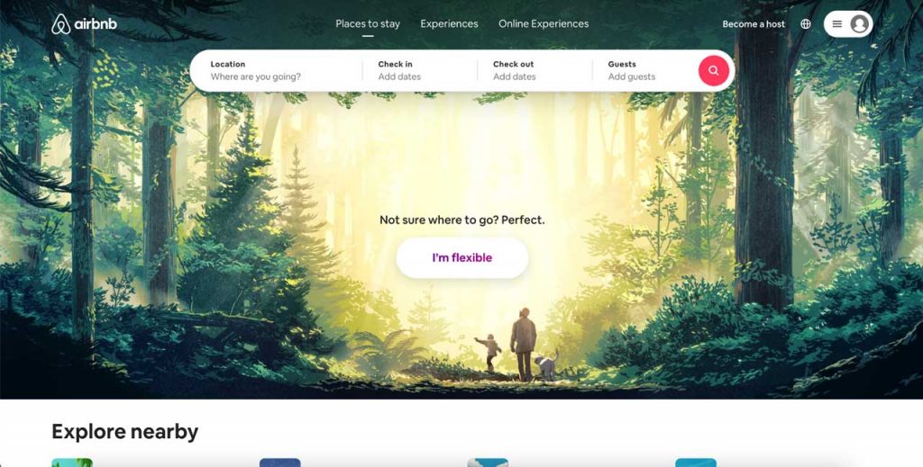
Above the fold content with an illustrated background. Source: Airbnb
The CTA search form fits their target audiences’ needs by asking questions relevant to booking a place to stay. This is efficient for users to follow through to the next step, and it reduces the bounce rate.
2. The Iconic
The Iconic homepage does well to define its target audience by using images and headlines to address them. The navigation tabs on top of the homepage direct users to browse products that interest them which simplifies their user experience (UX) while meeting their audience’s needs.
To ensure their customers stay on their website, they’ve stated their value proposition and implemented CTAs that focus on promotions and deals. They even have pop-up banners for new users to give them an incentive to shop around.
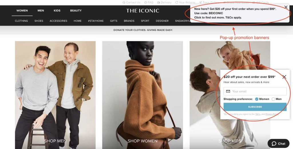
Above the fold content and pop-up promotional banners. Source: The Iconic
3. Zoom
It’s all about creating trust with your customers and Zoom executes this well through their homepage. The page introduces their purpose and offering through their headlines and subheadlines which makes it easier for users to get-to-know the company.
Their credibility is found below the fold where they include social proof of customer reviews and company testimonials. There are even videos and CTA’s to reinforce their reliability. The layout flows well as it helps skeptical visitors develop trust.
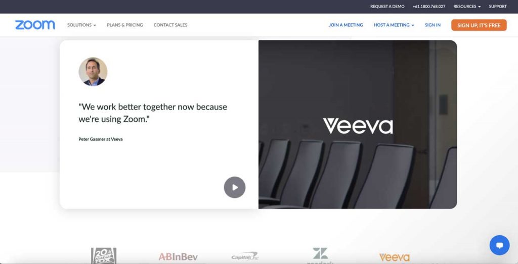
Company testimonial with a video to their review. Source: Zoom
4. Grammarly
What makes Grammarly’s homepage different from the others is that they introduce how their writing service works in a series of animated examples which is included above the fold. By immediately grabbing their attention and informing them, it motivates users to find out more.
The information is kept minimal to not overwhelm users and they’ve added an eye-catching CTA with social proof underneath which calls out to more hesitant customers to click through.
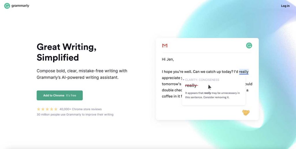
Above the fold content with an example of their service. Source: Grammarly
5. Doordash
Doordash’s homepage cleverly uses contrasting colours to make certain elements stand out. They use a red and white colour scheme to represent their brand image and make their CTA stand out more to draw in leads.
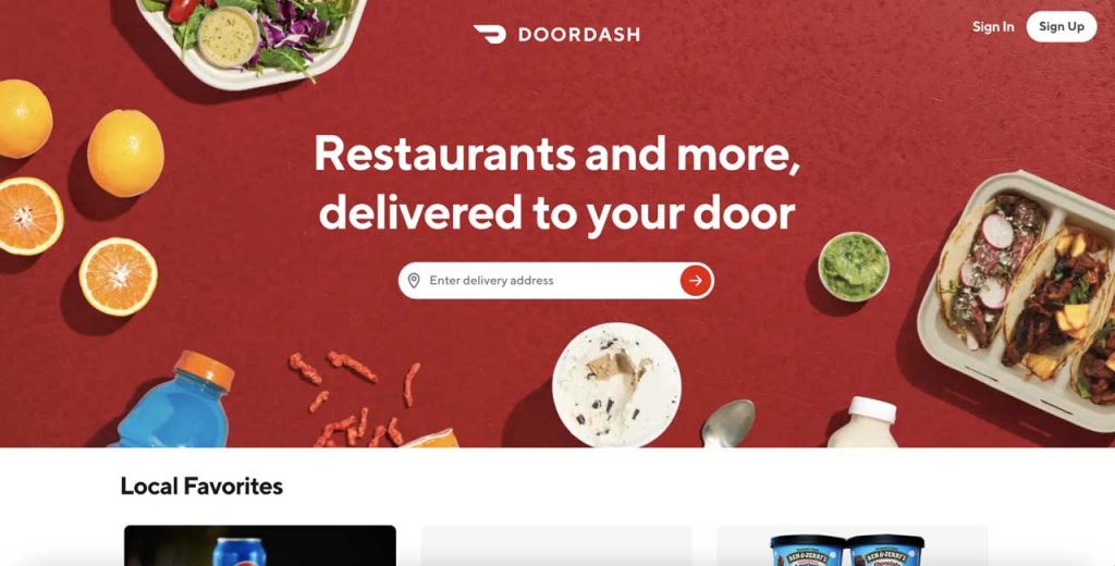
The homepage uses contrasting colours of red and white. Source: Doordash
The overall layout is clean and the navigation is direct so it provides a user-friendly experience that entices users to come back again.
6. Alya Skin
E-commerce websites face the challenge of deciding whether they should showcase their company, products or both on their homepage. Alya Skin’s homepage elaborately does well to include both. You can see they’ve included their mission statement to give users a reason to stick around.
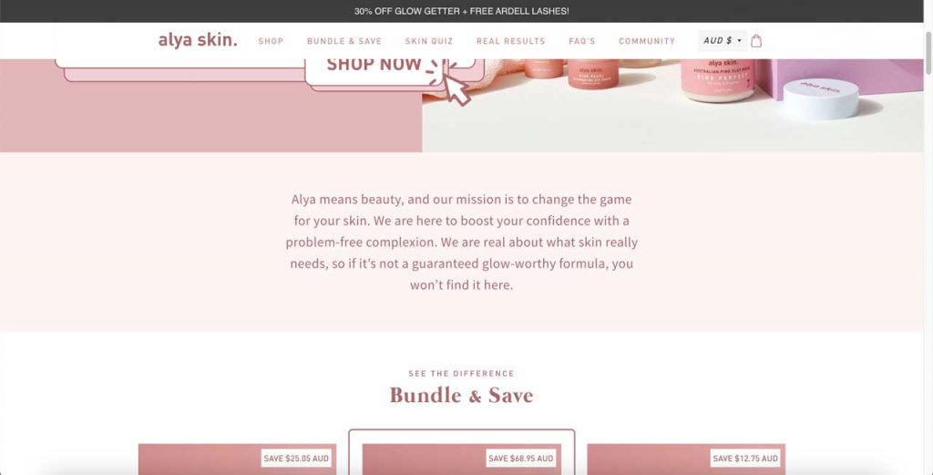
Alya Skin’s mission statement on their homepage. Source: Alya Skin
Their product range is then introduced with a ‘shop now’ CTA to get users to start their buying decision. To seal the deal, they even provide social proof of customer results, reviews and influencer endorsements to validate the company’s credibility and increase user’s buying confidence.
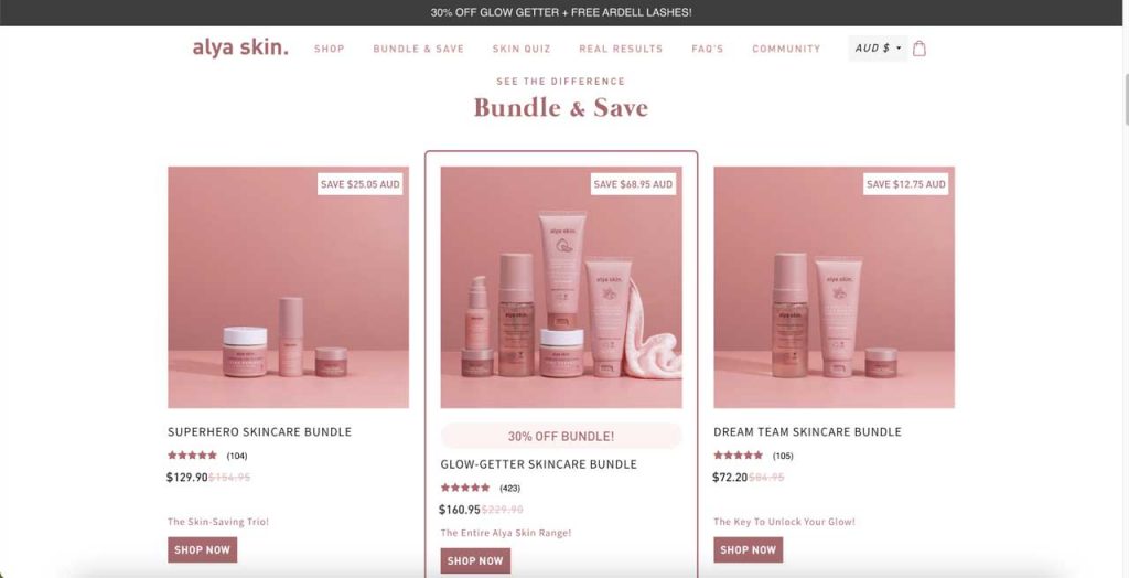
Alya Skin’s product range on their homepage. Source: Alya Skin
7. CommBank
It’s important to have a homepage with good UX as it can bring users back and even encourage them to share the website with others. CommBank’s homepage does this by including easy navigation and well-sectioned topics with CTAs. This creates a friendly UX where visitors can efficiently find what they’re looking for.
They even included a help section with a fun animated icon pop-up which enhances the UX and customer satisfaction – and that’s what creates loyal customers.
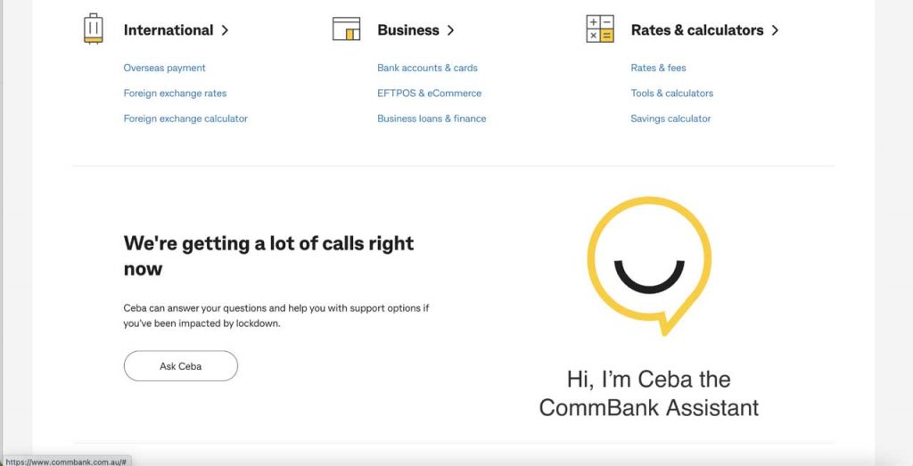
CommBank’s CTAs and customer assistance on their homepage. Source: CommBank
8. Evernote
The flow of information on Evernote’s homepage is nicely done as it helps to create a path to conversion. Starting from above the fold, they use large fonts to highlight their headline and subheadline. The eyes are then directed to the bright green CTA which can prompt users to click on it and go check out other pages on their website.
This is followed by the clever positioning of the image, where it only partly appears above the fold, which makes visitors curious to scroll down and find out more.
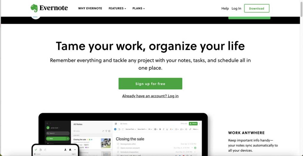
Evernote’s clever positioning of content above the fold. Source: Evernote
9. Honey
Honey is another homepage example that has a well-structured layout where it utilises white space to make it easy for users to process information. They also use different colours to section the page out so it doesn’t look too dull and repetitive. To make it even more engaging, they use animations to keep users on the page for longer.
To validate the company’s credibility, they’ve included social proof and hard numbers to impress the audience.
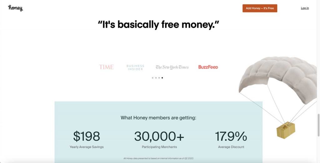
Includes company testimonials and hard numbers in their homepage. Source: Honey
10. Healthline
Some homepages require constant change to reflect the current trend, problems and needs – a great example is Healthline. Their homepage keeps users updated on the latest health stories and news, which persuades users to return to the page.
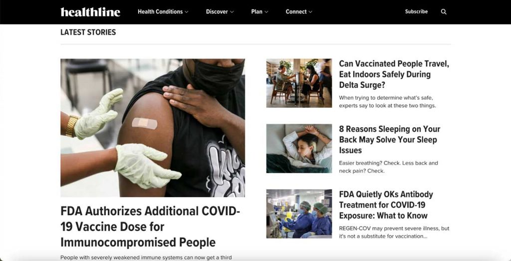
Latest stories on the homepage to keep users updated e.g. COVID-19. Source: Healthline
The page design is easy to navigate and with headlines sectioning the topics off, it keeps away from looking messy. They also use images to break the page up from being too content heavy while making the articles compelling to click on.
Make an Impactful Impression with Your Homepage
Get inspired from the 10 homepage examples we’ve listed and start designing your homepage now! There is no formula to a perfect homepage, but, adding these elements can definitely help your visitors feel engaged and kickstart the path to conversion.
If these homepage examples inspired you, check out our blog to learn how you can improve on your website design. Need more help? Get in touch with our talented team of web designers to get you started!