Have you ever taken a step back and thought about how easy it is for people to use your website? After all, your website is the face of your business and your brand. It’s the foundation of your online presence and identity and it’s important to make sure it runs smoothly and is user-friendly. If you don’t improve user experience, you run the risk of losing visitor traffic and in turn, the chance to convert customers.
So what can you do to make your website super friendly and easy to use? We asked our very own website designers and developers to give us their top 10 tips to improve your website’s user experience.
A quick review of UX and it’s importance
Before we dive into how we can improve UX, it’s helpful to understand what UX is and why it’s so important to the performance of your website. User experience, more commonly abbreviated as UX, is how a user interacts with a particular product or service; in this case, your website or app.
UX however goes even further than that. Good UX design emphasises having a deep understanding of users, what they need, what they value, their abilities, and also their limitations. Once you understand these aspects, you can start taking the necessary steps to create a product or service with a fantastic user experience design.
In terms of website design, good UX optimises the entire sales funnel and makes it as easy as possible for visitors to find what they are looking for. In other words, good UX removes obstacles, prevents distractions and ultimately increases conversions for you and your business.
Let’s take a look at our top 10 tips that will help you achieve great UX design.
Tip 1 – Improve the flow of information
To improve the user experience you need to consider how well your information flows. You could replace this tip with a number of different words – hierarchy, website structure, information architecture. The main idea though is to make sure that the information flows well from one another; providing the right information at the right time and guiding them to what they are looking for.
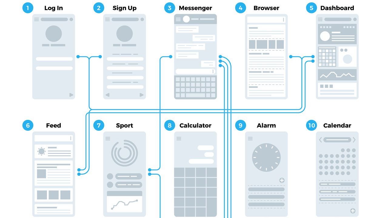
Put it this way. When a visitor visits your website, instead of being dropped into a hedge maze full of twists and turns, they should be welcomed with a simple, straightforward road, leading them directly to the solution to their problem.
You can achieve good flow or website hierarchy by improving:
- Navigation design
- Labelling
- Site Mapping
- Call to actions
Tip 2 – Use white space
White space is the area between and within design elements. It’s also one of the most overlooked aspects of web design. To many business owners, white space can be translated to wasted space, where the space could be used for more information or advertisements. But in reality, white space is a key element and helps balance design elements, makes text and content stand out and ultimately create a good visual user experience.

Fitbit uses plenty of whitespace to highlight elements such as their CTA buttons.
Without white space, web pages become overcrowded with content which makes for a mind-numbing, headache-inducing experience. Make the most important things on your webpage really stand out by surrounding it with effective white space.
Tip 3 – Familiarity is key
If it ain’t broke, don’t fix it. This applies to web design as well where conventions and familiarity reign supreme. We’re not saying to outright copy another good-looking website. But using design elements that users’ expect in a website can improve your UX.
When your website is familiar and uses conventional design, it lowers the user’s learning curve and makes it easier for them to take the actions you want them to take.
Some examples of conventional or ‘traditional’ website elements include:
- A top menu or hamburger navigation bar
- A search bar
- Grid layout for content
- Hero banners
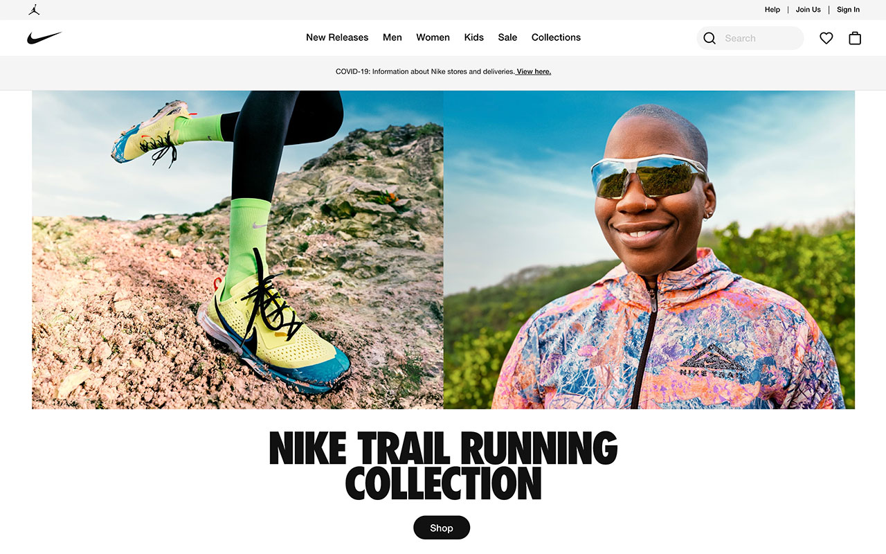
Image source: Nike
While there is always room for creativity and out-of-the-box design, users expect these kinds of elements. They’re tried and true and won’t leave your visitors scratching their heads trying to figure out how to use your website.
Tip 4 – Making sure your website is consistent
Another factor that goes into good UX is consistency. Consistency can refer to a number of things including your overall colour scheme, page layout and website elements.
A website without consistency is a website that looks like it was shoddily put together and doesn’t share the same goal or purpose. Inconsistency slows visitors down, causing them to lose interest and leaving your page.
Some things to pay attention to when ensuring your website is consistent include:
- Am I using the same colours throughout the website?
- Is my layout generally consistent across all pages?
- Are all my navigation menus in the same place?
- Are my text fonts consistent throughout the site?
- Do the form elements of my site have the same design across all pages?
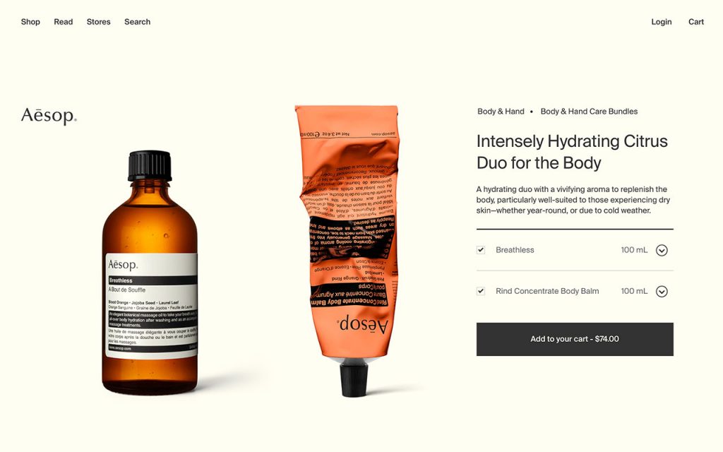
Image source: Aesop
Making sure your website is consistent throughout will reinforce your brand’s identity and image, make navigating your website easier and will contribute to great user experience.
Tip 5 – A responsive website
With the number of people now using mobile to surf the internet, it’s a must for your website to be mobile-friendly and easy to navigate no matter what device people use. In fact, over 50% of the population visit websites on their phone and if your site isn’t mobile-friendly and responsive, that’s 50% of traffic you can be potentially missing out on.
Responsiveness is a key step to improve user experience. It refers to how your website displays on different devices and screen sizes. A responsive website will include all the same content and optimises its appearance on the device it’s being displayed on. Not only is it good for user experience but it’s also good for SEO.
Tip 6 – Easy to read text
The text and copy in your website are where most of the information is and so it makes sense that it needs to be easily readable. When visitors have less than 15 seconds before they ‘bounce’, you need to make sure they find the information they’re looking for as quickly as possible – and highly readable text can do that.
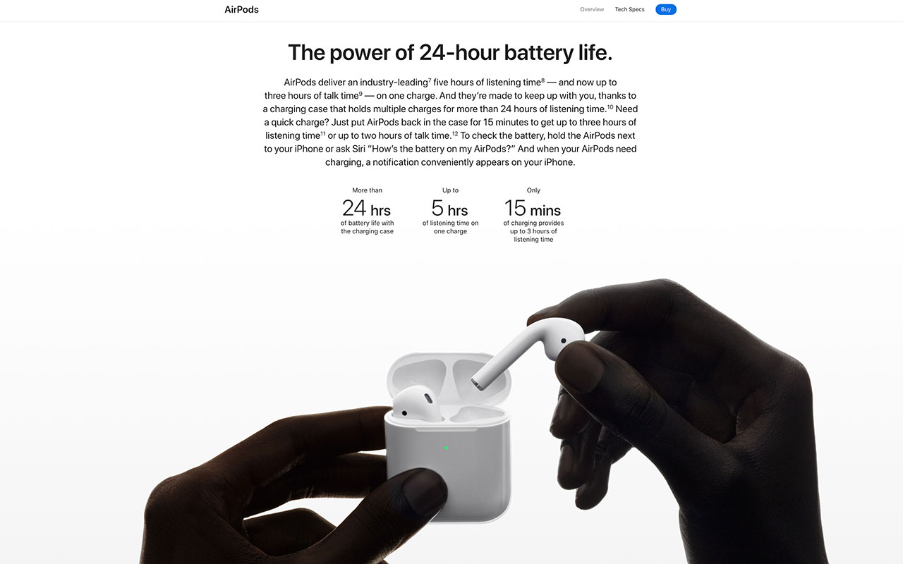
Image source: Apple
Readability involves both the design and the actual message of your text. Text that is too small, or clashes with the background makes it difficult to read. Text that doesn’t make sense or is poorly written will also make your visitors confused and gives them reason to look for a solution to their problem in another website.
Tip 7 – Quick website speed
There is nothing more frustrating than a slow-loading website. People expect websites to load quickly, and if your website takes a little too long to load it can cause visitors to simply bounce from your website. Research has shown that a page load speed of up to 10 seconds can increase your bounce rate by 123%!

The longer the load time, the greater the bounce! (Source: Google)
You can find out your site’s speed, you can use a tool like PageSpeed Insights. To increase your website loading speeds, you can compress and optimise images, reduce redirects, and optimise your code.
Tip 8 – Troubleshooting
Broken websites lead to poor user experience. It’s an obvious observation but its importance can’t be understated. Websites that are plagued with 404 errors, bugs, and missing elements and pages can leave a bad taste in your audience’s mouths and also negatively impact the trust between you and your customers.
There are many tools available that can help you find and solve any bugs or issues present on your site. Making sure these errors are quickly identified, addressed and fixed can help you maintain good user experience for your website.
Tip 9 – Use appealing Calls to Action (CTAs)
As we mentioned before, when visitors come to your website or landing page they want to find what they are looking for as quickly as possible. This is what makes CTAs one of the most important elements in design. Having clear, appealing and helpful call to action buttons on your website can help direct visitors to where they want to be.

Trello puts emphasis on their free service and encourages action in their CTAs.
When creating CTAs, both the design and the actual words you use are crucial to how effective they are. Your CTA buttons should be bold, should stand out and capture attention. Choosing the right words is also important. Leave the typical ‘Click Here’ or ‘Learn More’ CTAs behind and use words that encourage action now such as ‘Shop NOW’ or demonstrate the value you provide like ‘Start Recording’.
Tip 10 – Use original images
A picture is worth a thousand words. That cliche has never been more true when it comes to web design and user experience. Images are key in giving your audience a visual example of what your brand is all about. Relevant, high quality and well placed images will create trust, support your content and drive conversions.

Nexba uses original photos of their product and staff to make a connection with their audience.
The key word there is relevant. Using a random assortment of images will only distort the message you’re trying to communicate. Stock photos are prime examples of this. While a stock photo can be related to your service, it’s not always relevant to your brand as it’s not original nor unique.
When you use images, try to make sure they are original and unique to your brand, so it creates a connection and delivers your message effectively.
Great web design and UX go hand in hand
Your typical website visitor doesn’t leave your website thinking ‘what great UX!’. If anything they’re more likely to remember any bad experiences they might have had on a website. That’s because a well designed UX is seamless, effortless and consistent.
It works to create the smoothest and most enjoyable experience for your visitors. Without it, you put your brand at risk of losing trust, reputation, traffic and conversions.
Want more articles on how to improve user experience on your website? Or maybe you’re looking to audit your website or improve it’s mobile-friendliness?
Head on over to our digital marketing blog or see what our talented team of web designers can do for you!