Question: what makes a brand so recognisable? What makes it so memorable that you know what it looks like just at the mention of it? You could point to a unique product, a relatable brand story and brand voice or an unforgettable shopping experience. And you wouldn’t be wrong, those are all part of creating a memorable brand personality and brand identity.
But it’s a brand’s visual style that contributes the most to how recognisable and memorable a business is. From their logo, their typography to the colours they use, these brand elements work together to create an identity that stands out from the rest.
In this article, we line up 10 of our favourite and best brand style guide examples to demonstrate our point. We’ll also give you some inspiration if you’re in the middle of making your own!
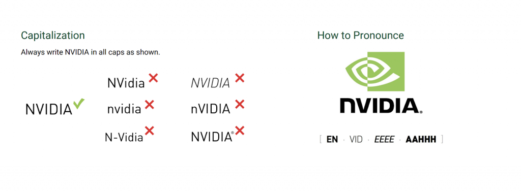
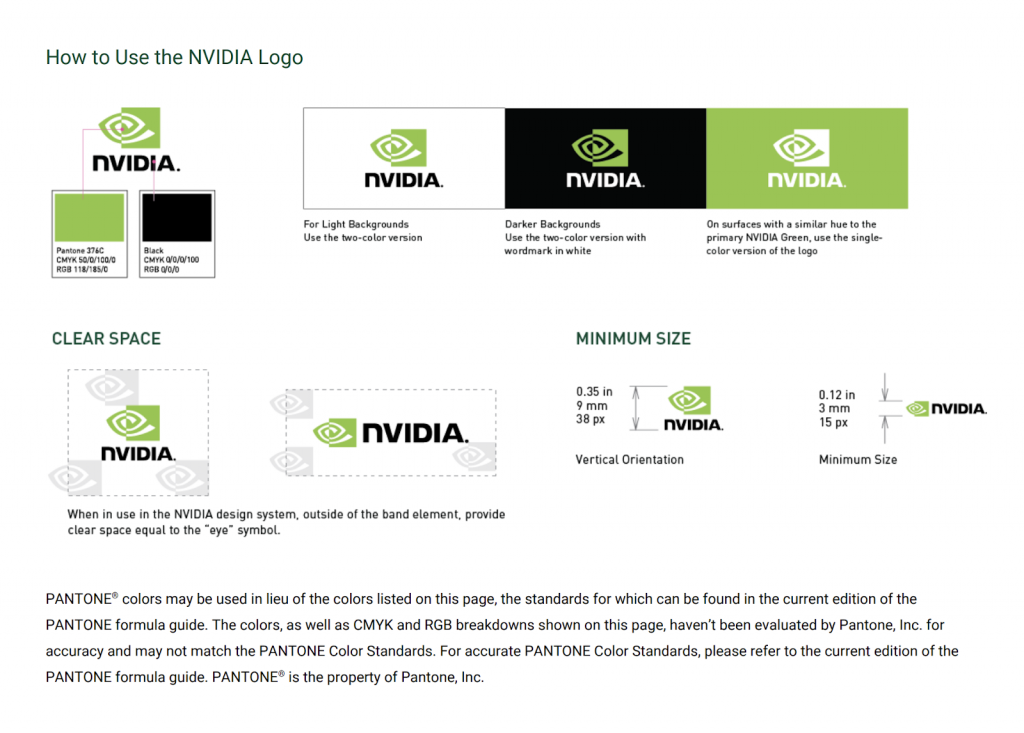
NVIDIA
Technology company NVIDIA is most well-known for their graphic processing units (GPUs) that are used throughout the gaming and professional markets. NVIDIA’s distinct style separates them from their competitors in the computer part manufacturing industry. Their guidelines are highly detailed and put a lot of emphasis on how to use their logos and designs.
They cover where to use them, whether to use the NVIDIA logo or badge, and even how to pronounce NVIDIA. This ensures that their brand is not used in the wrong way or in undesirable situations, thus cementing their high reputation as leaders in their industry.
JB Hi-Fi
We know you recognise the JB Hi-Fi brand. Their use of loud, eye-catching colours (especially yellow) and big, bold fonts makes the JB brand something you can’t miss. Their brand guidelines are incredibly detailed and focus on their colour palettes, ideal photography style and the ‘don’ts’ of their branding. JB Hi-Fi’s style combines a modern, high-tech theme with a casual, everyday feel, which communicates their position in the retail industry – a tech retailer made for everyday people.

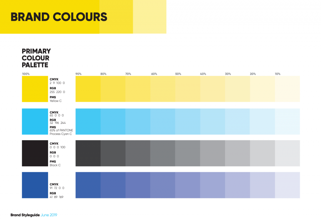
Source: JB Hi-Fi
Los Angeles Lakers
When it comes to the world of sports there are a few franchises that break through the sporting bubble, becoming super recognisable in the mainstream population. Examples include football giants Manchester United or the iconic New York Yankees from baseball.
One of the most recognisable sport franchises in the world is the NBA’s Los Angeles Lakers. Their logos and colour palettes are rooted in their history and represent the Lakers’ tradition and success. Their design has been the same for decades, a sign of their strength as a brand. The strong brand of the Lakers has allowed them to become one of the most famous and most followed sporting teams in the world.
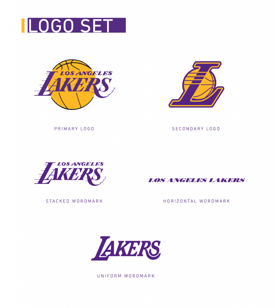
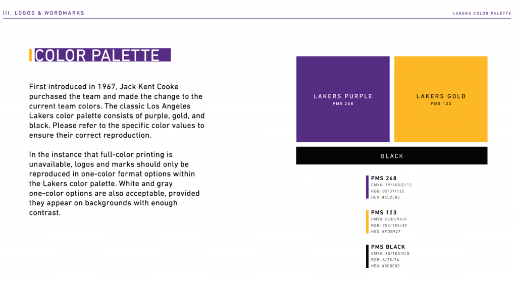
Source: Los Angeles Lakers
Calvin Klein
Another company we think needs to be a part of our best brand style guide examples is Calvin Klein. Calvin Klein is a widely popular fashion brand, known for creating clothing, jewellery, accessories and perfumes.
The Calvin Klein brand (also known as CK) utilises a minimalist design for most of its styling. However, despite this minimal design, it is still easily recognisable amongst consumers. It uses thin fonts, greyscale colours and white space to create a visual identity that is sleek, modern and most importantly, highly memorable.
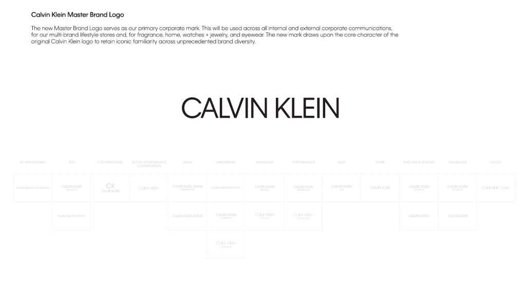
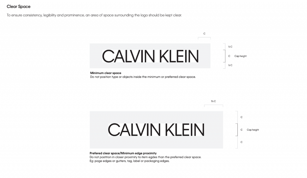
Source: Calvin Klein
Heineken
Heineken is one of the leading beer manufacturers in the world and one of the most recognisable. They possess multiple brand assets which help them stand out, the most prevalent of these is their distinct green colour palette. Their style guide uses the colour green to its fullest, making it the centerpiece of their visual identity. Heineken’s branding is consistent throughout the style guide, utilising different hues and gradients of the colour green. If your brand has a single standout colour, take advantage of it and use it to the fullest to create a visual identity that is instantly associated with that colour.
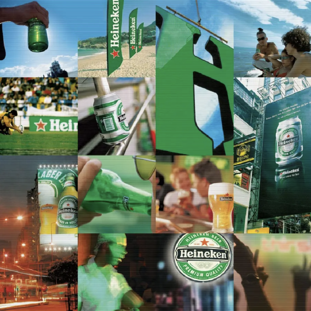
Source: Heineken
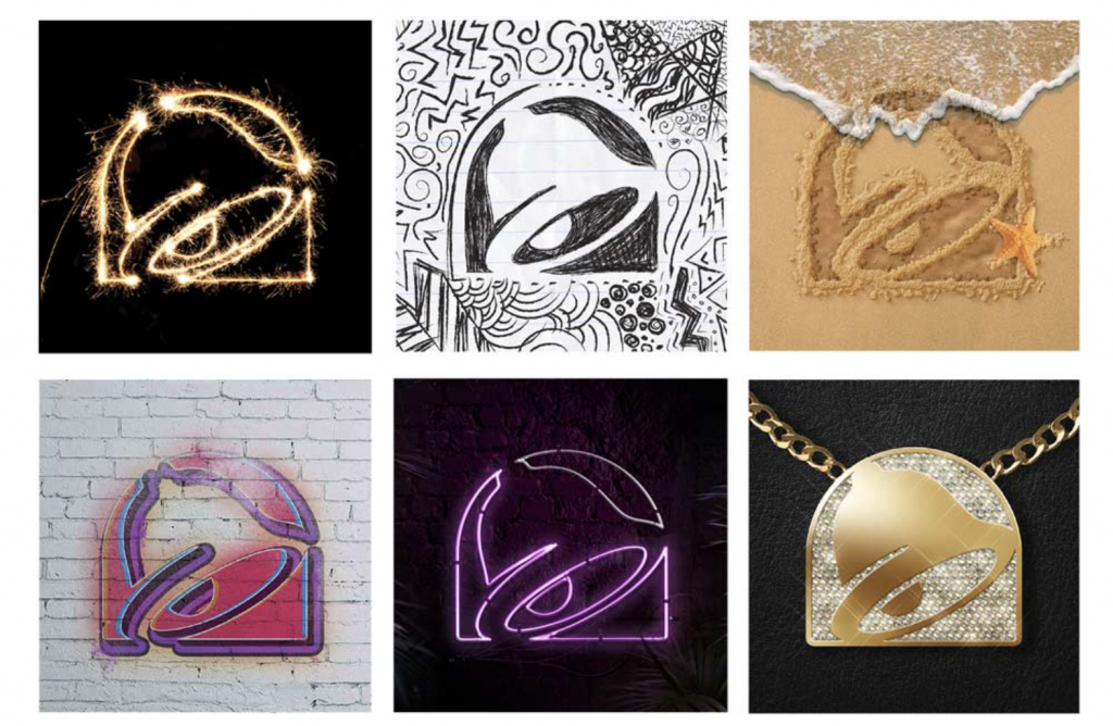
Taco Bell
Fast food chain Taco Bell may have had its start in the United States, but it’s brand is well known throughout the globe. The biggest difference between Taco bell and the others on our list of the best brand style guide examples is that they have a wide range of colours and logos splashed in every colour of the rainbow. In a recent branding project, Taco Bell decided to ‘no longer make our logo sacred or untouchable like everyone else’, which in itself makes it stand out from the rest!
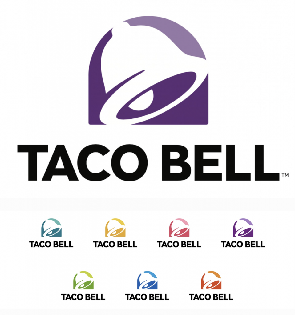
Source: Taco Bell
Roblox
Roblox is an online game platform and is one of the most popular games in the world, especially with children between the ages of 5 to 12. Because of their young userbase, Roblox tailored their branding to target not only this target demographic but their parents as well. The Roblox logo design is large, bold and cartoony which appeals to their young target audience. Also, their style guide includes bright colours and tagline use to help reinforce their personal brand.It also helps instil confidence in the parents of these children, assuring them that the game is appropriate for their young ages.
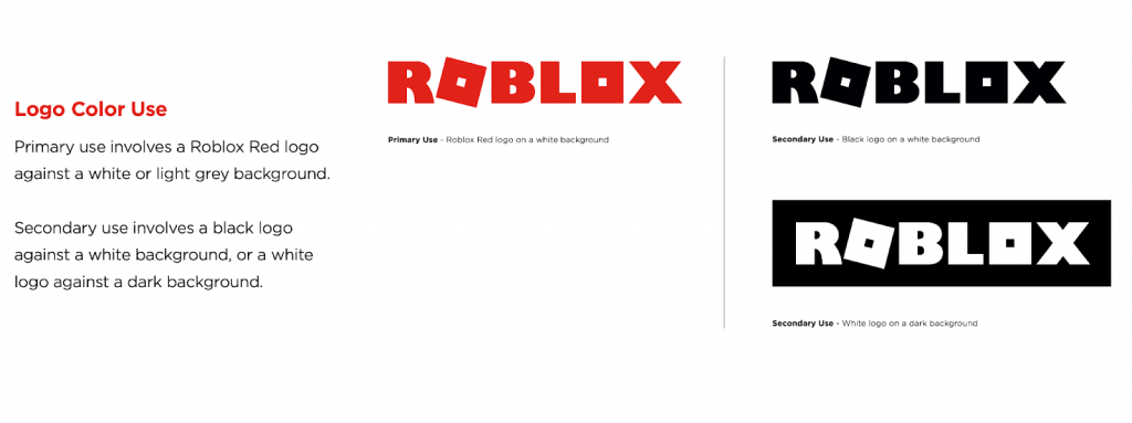
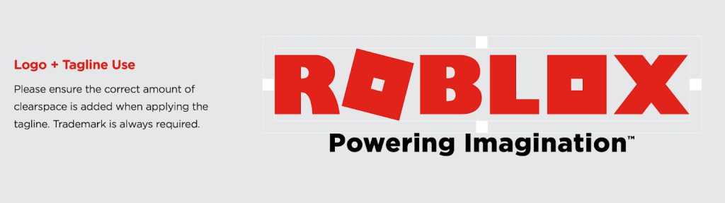
Source: Roblox
Hyundai
South Korean car manufacturer Hyundai has a minimalist yet modern design, with multiple variations of its logo for multiple purposes. Hyundai has horizontal, vertical and symbol-only versions as well as a colour palette featuring different colours (such as blue, black and gold).
Having variations of your logo is useful as it allows for its use in a wide range of mediums and formats. This helps your brand reach a wider audience, thus increasing brand recognition and brand awareness. Hyundai is proof of this concept; the company is currently in the top 5 of car sales in Australia.
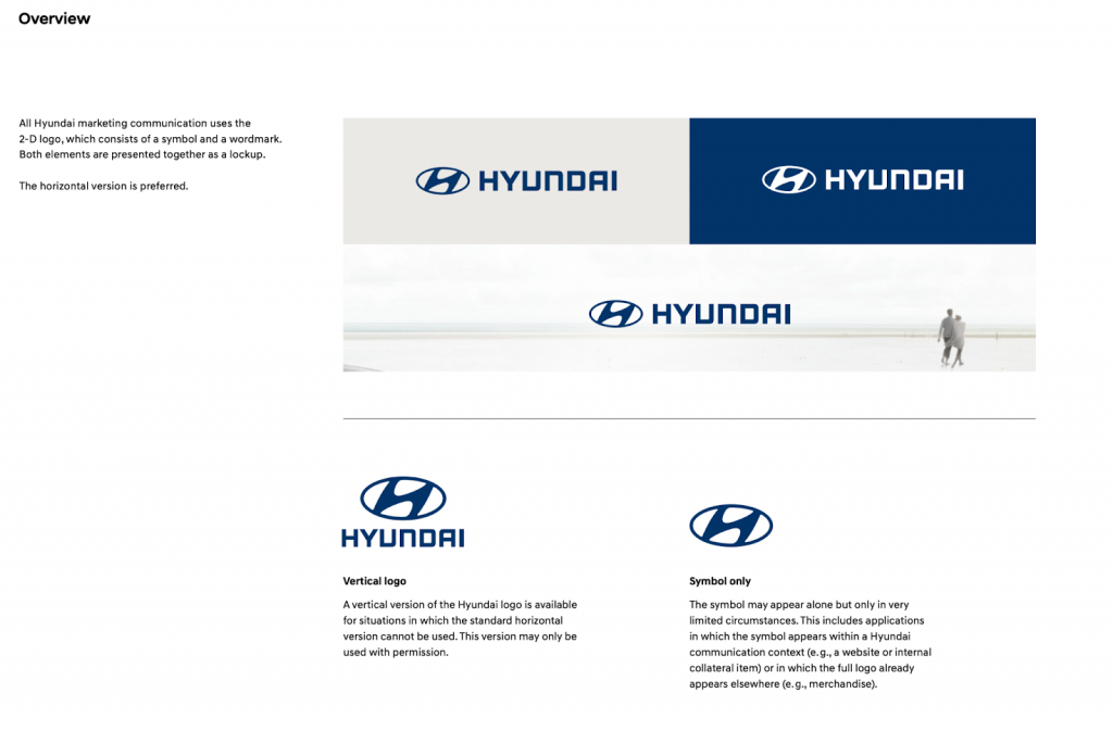
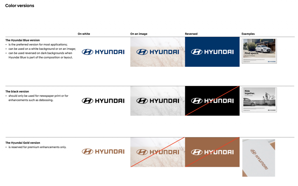
Source: Hyundai
Discord
Discord is a Voice Over Internet Protocol (VoIP) platform which also features instant messaging and file sharing. The voice platform is the leading brand of its kind, beating out other competitors such as Skype and Zoom. Discord has a unique and easily recognisable style guide.
Their standout feature is their mascot, Clyde, which doubles as their logo and icon. Clyde instantly separates Discord from their competitors and makes it easy to distinguish them. Combine their strong visual branding, their great service and superior users experience (UX), and it’s easy to see why Discord went from 10 million users in 2017 to 140 million in 2021.
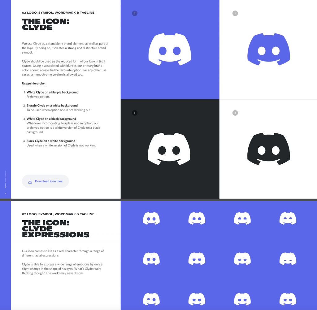
Source: Discord
Qantas
You don’t have to see a photo to remember what Qantas, Australia’s leading airline, looks like. Qantas is an uber-memorable brand, with distinct visual assets such as their red colour palette and distinctive kangaroo logo. The Qantas style guide delves even further into their visual identity, and the messages it wants to convey through their brand style. It does this through specific instructions in regards to photographic style, logo placement and advertising layouts.
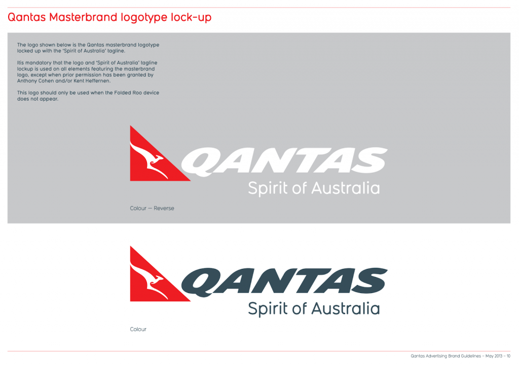
Source: Qantas
Brand style guides don’t have to be purely about logos or visual assets either. They can also be used to outline your company’s values and vision and mission statements. Qantas’ guide is a prime example of this, where they explain what Qantas is and what they aren’t. This gives both internal and external stakeholders an overview of what the company is all about.
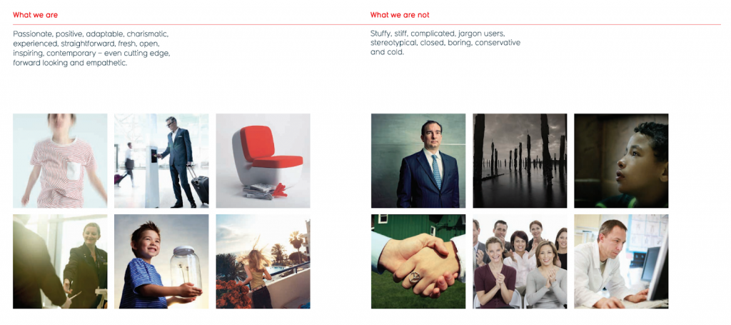
Source: Qantas
Use these best brand style guide examples to help you create your own!
A great brand style guideline can help you create a consistent visual identity that lasts in the minds of your customers. Take inspiration from these best brand style guide examples and craft your own! Need a hand in creating your own style guide for your business? Get in contact with our graphic designers and brand specialists, where we’ll be more than happy to create a brand book just for you. And don’t forget to visit the ZipZipe blog for more branding tips!